

Discover the key to E-commerce success with Mobile-First Design strategy that enhances user experience and drives conversions. Learn how prioritizing mobile can revolutionize your online business growth.
The Importance of Mobile-First Design
In the digital era where smartphones have become an integral part of people’s lives, embracing mobile-first design is crucial for e-commerce success. This design approach prioritizes creating a user experience tailored specifically for mobile devices before considering the desktop version.
Mobile-first design is essential because a significant portion of online traffic comes from mobile users. With the increasing number of people browsing and making purchases through their smartphones, having a website optimized for mobile devices can significantly impact conversion rates and overall revenue.
By focusing on mobile-first design, e-commerce businesses can enhance the accessibility and usability of their websites on smaller screens. This includes optimizing page load times, simplifying navigation, and ensuring that content is displayed correctly across various mobile devices.
Moreover, mobile-first design also plays a vital role in improving search engine rankings. Search engines like Google prioritize mobile-friendly websites in their search results, which can boost visibility and drive more organic traffic to e-commerce platforms.
Ultimately, by embracing mobile-first design, e-commerce businesses can stay ahead of the competition and cater to the evolving needs of tech-savvy consumers who prefer shopping on the go. Investing in a mobile-friendly design strategy is not just a trend but a necessity for long-term success in the digital marketplace.
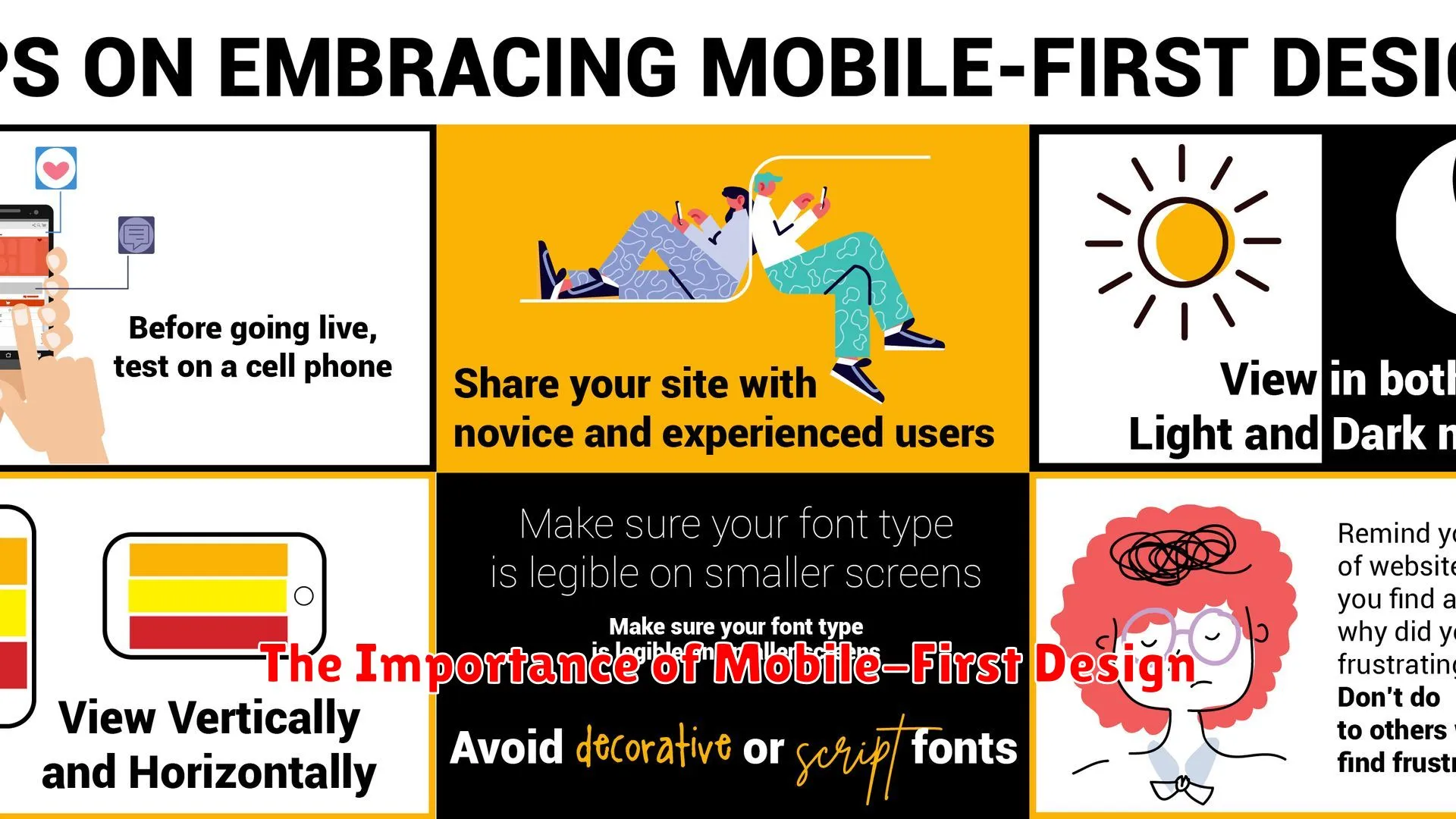
Key Elements of Mobile-Friendly Websites

In today’s fast-paced digital landscape, creating mobile-friendly websites is essential, especially for e-commerce businesses aiming for success. To achieve a seamless mobile-first design, there are key elements that need to be incorporated:
Responsive Design
Responsive design ensures that your website adapts to different screen sizes and devices, providing a consistent user experience across all platforms. This is crucial for engaging mobile users and maximizing conversions.
Fast Loading Times
Mobile users expect fast loading times. Optimizing website speed by compressing images, minifying code, and utilizing caching techniques can significantly improve user retention and satisfaction.
Clear and intuitive navigation is vital for mobile users to easily explore your website. Simplify menus, use dropdowns sparingly, and implement touch-friendly gestures for seamless browsing.
Optimized Content
Creating optimized content for mobile devices involves concise messaging, legible fonts, and strategic placement of call-to-action buttons. Tailoring content for smaller screens enhances readability and engagement.
Mobile Payment Options
For e-commerce success, providing mobile payment options is crucial. Integrating secure and convenient payment gateways optimized for mobile devices can streamline the checkout process and boost conversion rates.
Optimizing for Mobile User Experience
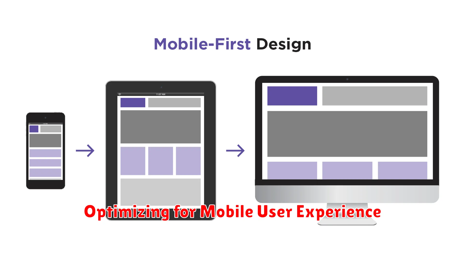
In today’s digital landscape, optimizing for mobile user experience is crucial for any e-commerce business aiming for success. The shift towards mobile-first design has become increasingly important as more consumers rely on their mobile devices to browse, shop, and make purchases online.
When it comes to embracing mobile-first design for e-commerce, ensuring a seamless and enjoyable user experience is paramount. This involves creating responsive websites that are optimized for mobile viewing, easy navigation, and fast loading speeds. Mobile users expect efficiency and convenience, and a well-designed mobile interface can significantly enhance their shopping experience.
Implementing mobile-first design principles also involves prioritizing mobile features and functionalities during the development process. This means simplifying the checkout process, optimizing search functionality, and streamlining navigation to provide mobile users with a hassle-free experience.
By emphasizing mobile user experience, e-commerce businesses can increase engagement, boost conversions, and foster customer loyalty. Through strategic design decisions and a focus on mobile optimization, businesses can stay ahead in the competitive e-commerce landscape and drive positive results.
Testing and Refining Mobile Design
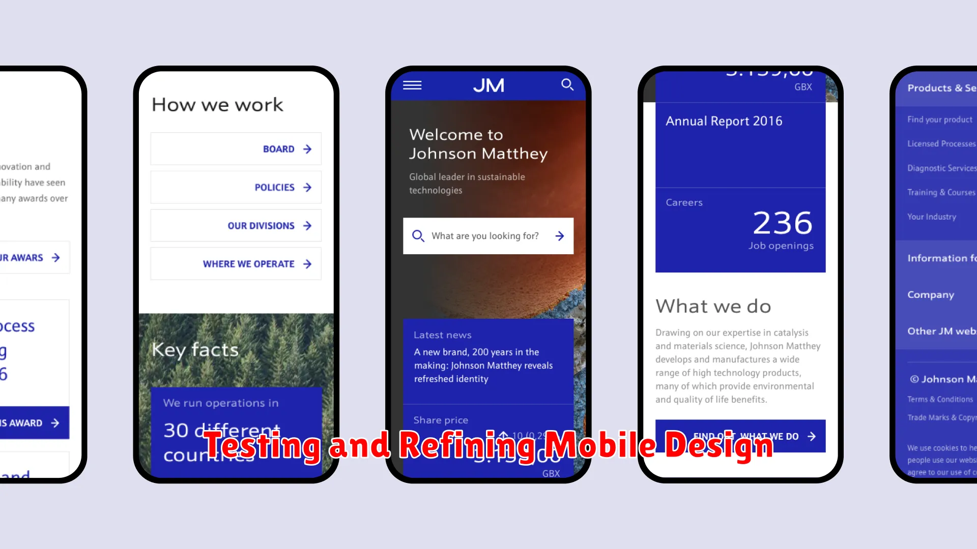
Embracing a mobile-first approach in e-commerce design is crucial for staying competitive in today’s digital landscape. Once you have developed your mobile design, the next step is to focus on testing and refining it to ensure optimal user experience and conversion rates.
Testing plays a vital role in identifying any usability issues, technical glitches, or design flaws that may hinder the effectiveness of your mobile site. Conducting thorough testing across different devices, browsers, and screen sizes is essential to ensure a seamless user experience for all visitors.
It’s important to pay attention to user feedback and data analytics to gather insights into how customers interact with your mobile site. Utilize heatmaps, click tracking, and A/B testing to understand user behavior and make data-driven decisions to enhance the design and functionality of your mobile platform.
Refining the mobile design involves continuously optimizing the layout, navigation, and visual elements to meet the evolving needs and preferences of mobile users. This could include simplifying the checkout process, improving loading speed, or enhancing the mobile search functionality to drive conversions and improve customer satisfaction.
By iteratively testing and refining your mobile design, you can create a user-centric e-commerce experience that not only drives sales but also fosters customer loyalty and brand advocacy. Embracing a data-informed approach to mobile design will position your e-commerce business for long-term success in the mobile-driven market.
The Impact of Mobile Design on Sales

Effective mobile design can have a significant impact on sales for e-commerce businesses. In today’s digital age, where consumers increasingly shop online using their smartphones and tablets, having a mobile-friendly website is essential for success. Here are some key ways in which mobile design influences sales:
1. Improved User Experience
Mobile-first design focuses on creating a seamless and optimized user experience for mobile users. A website that is easy to navigate, loads quickly, and provides a smooth shopping experience will result in higher conversion rates and ultimately drive sales.
2. Enhanced Accessibility
By adopting a mobile-first approach, e-commerce businesses ensure that their websites are accessible to a wider audience. This includes users who prefer shopping on mobile devices as well as those with disabilities who may rely on mobile technology for online transactions.
3. Increased Engagement
Mobile design that is visually appealing and interactive can captivate users and keep them engaged with the brand. Features such as responsive design, intuitive navigation, and mobile-optimized content can encourage users to explore products and make purchases.
4. Faster Loading Times
Optimizing a website for mobile devices typically involves reducing unnecessary elements and improving loading times. A fast-loading site not only enhances user experience but also reduces bounce rates, leading to higher engagement and increased sales opportunities.
5. Competitive Advantage
Businesses that embrace mobile-first design gain a competitive edge in the e-commerce industry. With more consumers shopping on mobile devices, businesses that prioritize mobile design are more likely to attract and retain customers, driving sales and fostering brand loyalty.
Conclusion
Embracing mobile-first design is crucial for achieving e-commerce success in today’s digital landscape, ensuring seamless user experiences and driving higher conversions.